Small Business Moving and Design: Part 1- Deciding on a Theme for Your Small Business
- Monica Montanari
- Apr 9, 2020
- 3 min read
Updated: Apr 14, 2020
This is part 1 of a 5 part series on small business moving and design. To read the entire series, click here.
A lot of small businesses, ours included, don't have the expendable income to be able to hire a designer to make our office look the way it should- but seeing as you spend more time in your office than pretty much anywhere else, I am of the opinion that your office needs to be as comfortable as home to you. So after years of begging and proving my talents, I was finally given the green light by my boss to make this new office one that we could all be proud of. But, like any interior design project, I needed to start with a theme.
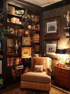
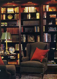
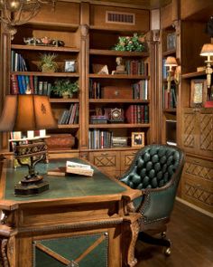
This was a tough one. I would have loved to go with a sleek, chic, modern office theme that would make everything look like we actually plan to live in the future. But, seeing as my budget was limited, I had to make due with what I got. The first thing I decided to do was to see what theme we were already kind of working with, and evaluate that. From the two stately equestrian photos in the hallway, the dozens of different tones of dark wood, and the tufted leather chairs, I came to the conclusion that only one theme was workable: antique English. It seemed as though this was the theme they had kind of been aiming for the whole time, they just didn't know how to execute it properly. So this became that time, and I was then able to draw some inspiration from Pinterest.
I am a person of passion- and I rarely will do things that I can't find a reason to love. So I had to make myself fall in love with the theme in order to do it justice- and I did that by looking to literature and cinema to get me excited about antique English details. Any of you how know me either in real life or just from reading my blogs, know that I am a Disney fanatic. So when I thought of 1800s England, I immediately thought of Peter Pan and Mary Poppins. I've spent considerable time studying what makes Disneyland and Disney in general so magical- and one of the things that I have deduced is that Disney isn't magical because it is plastered with images of their famous characters. Rather, it's from the tiny magical touches that get placed into mundane, everyday places. So one of the key areas of focus for me was keeping things highly professional, with such a little hint of magic that you'd only notice it if you were told. Peter Pan, being one of my favorites, was one of the themes I decided I would mix in, but another one was just calling to me.
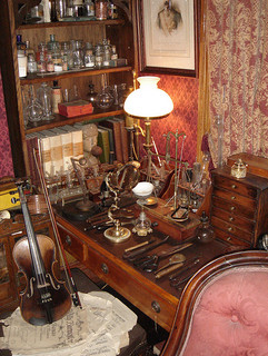
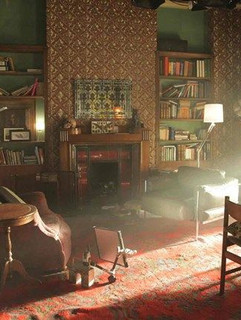
Sherlock Holmes. I have no idea why, but ever since I discovered the brilliant character created by Sir Arthur Conan Doyle, I was obsessed. I must have been around 9 years old. So finally, I saw the perfect opportunity to bring back my love for a character living and working in the very time period I sought to evoke. A little apartment on Baker Street quickly overtook my inspiration, and became the theme I had been looking for. Professional, classy, and something I was passionate about: it was perfect. I put together inspiration boards and slowly started refining my ideas to come up with an exact theme reminiscent of an apothecary in a brilliant Englishman's antique apartment.
So, how did I bring that theme to life? Continue reading on to Part 2!










תגובות