Creating a Sophisticated Peter Pan Office
- Monica Montanari
- Aug 31, 2022
- 10 min read
Updated: Jul 17, 2023
Okay, so, if you're anything like me, you've been obsessed with Disney's classic animated films since your childhood, and seek to bring that same kind of magic to every aspect of your life.
If we're even more alike, you spend way too much time in your office. So seeing as I do more living in here than anywhere else, I wanted to focus on making it somewhere that I would be excited to spend every day. Now that's some magic I don't even know if Walt himself could pull off, but you know the Creative Coach Monica is always here to give it a shot. "Heree weee goooo!" (If you didn't read that and hear Peter Pan saying it, just leave now.) Everybody else, come with me and let's make some magic.
Choosing My Theme
If you read my moving series, you know that my latest passion project has been infusing design into an otherwise uninspired law office. While that series focused on the office as a whole, I never got to talk about my little corner of the world (which is probably because I neglected it until everything else was well under way). If you read Part 1: Deciding on a Theme, you might remember this paragraph:
"...Disney isn't magical because it is plastered with images of their famous characters. Rather, it's from the tiny magical touches that get placed into mundane, everyday places. So one of the key areas of focus for me was keeping things highly professional, with such a little hint of magic that you'd only notice if you were told...."
My goal was to have my personal office serve as the penultimate example of that kind of Disney design- and since I had chosen to focus more on a Sherlock Holmes theme throughout the rest of the office (because of how much more I had to work with), my personal office got tasked with carrying out the Peter Pan theme that I had reserved for somewhere special!! (This GIF made me laugh way too hard to not include it in here).
Planning the Space
The first thing I needed to worry about was the shape of the office. Never in my life have I ever seen a weirder-shaped office.

.....Who thought this was a good idea? At first that was a bit of a bummer for me- but then I chose to see it as my opportunity to show how I could utilize even the most unconventional spaces and make them absolutely charming.
Originally, I had planned for everything to
face toward the door where you enter the office- but I soon realized that orienting things that way would leave me with my back toward the windows, which are the aspect of this office I was most excited about. (We don't even have time to get into my love for natural lighting here). So, I quickly realized that I would have to change things around from my original plan, and started having to get creative (bring it on).
While you can plan your individual office space with miniatures as I advised in Part 2 of my Small Business Moving and Design series, eventually, with something as personal as your office, where you'll be spending most of your life (if you're me), you'll want to lay it out for real. By the way I'm sorry for how almost every image in this post is blurry-lol. I apparently needed to wipe off my lens. Oops.

So, I got blue painter's tape, and using the measurements I had taken of the furniture that would be ending up in my office, I laid out the shapes onto the carpet. Once those were laid out, I was able to move the outlines around to see where things would fit best. Here's a key tip I've found helpful: start with the largest furniture first. Then, if you're anything like me and are obsessed with natural light, orient yourself to be able to see out the windows. Never underestimate the power of some sunlight.
Ultimately I realized that if I tried to put any visitors' chairs in front of my desk, the entire room would be inaccessible. So instead, I used my weird little space to create an adorable sitting area that just looks like it was the intention of this office all along (you'll get to see that below).
Gathering Inspiration
This is usually where I would turn to Pinterest immediately- but unfortunately, for some projects, you've got to be your own Pinterest. For this project, I was able to find maybe 2 or 3 inspiration pieces- but they were all for nurseries.
The goal here is to not make your office look childish to the untrained eye (only professional children should be able to pick out the references). So while I used the more sophisticated ideas from those nurseries, I realized quickly that I was going to have to research the film as my main source of inspiration. So one of the things I decided to do was make a list of all of the aspects of the movie I was considering (for example: stars, crocodiles, mermaids, pirates, clocks, fairies, etc.). From there I could start to figure out what I should focus on first.
The toughest part was that, in order for my design to be professional and less obvious, I had to single out one setting from the movie and focus mostly on recreating that place whilst adding little touches from every other part of the movie. This setting was the Darling's nursery. It is featured in the film for all of 5 minutes, so I had to go through the movie and take pictures of all of the little details in the nursery so I could remember. Another helping hand came from the new queue for Peter Pan's Flight at Disney World, which has been built out to show a bunch of fun aspects of the house, including the nursery.
Focusing on Furniture
There really were only a few optional furniture pieces involved here: obviously I needed my desk, my credenza, etc. etc. Luckily for me, our office already had major antique English vibes- which included the presence of tons of cherry wood, which fit right in with the inspiration:
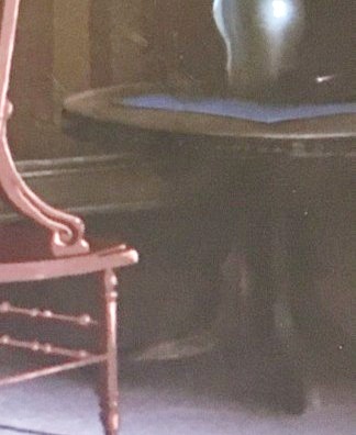
My desk and credenza were already cherry wood, so I decided to find a little sitting area table to channel this circular one from the Darling's nursery. When I found this beautiful piece with its style and functionality, I knew I had found a match that would allow for some storage, and it was the perfect size to go in between my chairs:
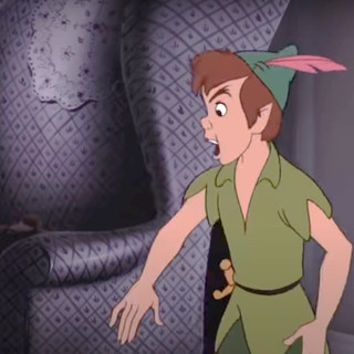
Speaking of which... we had plenty of unused, ugly chairs sitting in the library waiting to be loved, but they just weren't going to do the trick. So I hunted down two matching chairs that would look as close to the movie as possible without being purple. I settled with a light green fabric which shared a similar diamond pattern to the chair shown in the movie.
With their subtle hue to tie in the existing carpet and remind us of a certain someone's tights (have we ever figured out why Peter is in tights?) and two doilies made by my late great-grandmother, I was able to channel that scene while keeping things professional, subtle, and authentic.
Paying Attention to Detail(s)
This is the fun part. The little details in décor are my absolute favorite- and for a project like this, they are absolutely crucial to success. So I did an absurd amount of research (which you can read about if you care), and included GIFs whenever possible below. You're about to see what way too much attention to detail looks like- lol! Take a peek at how I tied several aspects of the movie into my office: did you notice these little details about the movie before?
John Darling:
The middle child of the Darling three, John is all logic all the time. Ever the skeptic, his transformation into a carefree child by the end of the movie is one that audiences of Peter Pan hold dear.

To pay special homage to him, I created a sweet
little reading area in between my chairs- complete with a reproduction of the original Peter and Wendy book by J.M. Barrie with the original illustrations. A pair of round, black glasses make the reference unmistakable.
Michael Darling:
I did way too much research on this one. As you'll notice, the youngest of the Darling kids, Michael, won't leave home without his teddy bear. So I took a look back into the history of teddy bears. J.M. Barrie first released Peter Pan and Wendy in 1904- which seemed to be consistent with the time period around which the Disney movie was centered based on the clues from the scenes in the nursery.
I planned to get a teddy bear that was authentic to that time and place it on the chairs- but alas, the availability of them, cost of them, and the appearance of being an adult with a teddy bear sitting in your office was just weird to me. But know that I did a ton of research to not do anything. Haha!
The Hurricane Lamps From the Nursery:
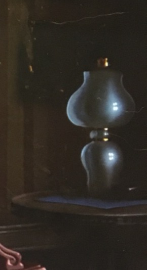
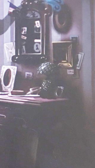
Blink and you might have missed them. Seriously. In the darling's nursery there are a number of lighting fixtures- but since nobody would let me put a chandelier in here (rude) and wall sconces with actual fire are usually frowned upon in work environments (boo), I decided to settle for a lamp that could tie in my antique brass pieces, allude to the 'outdoor' setting of the rest of the plot, and captured the feel of the lamps in the movie. I learned so much about lamps throughout this process- and because I'm such a fan of good lighting, I make sure to turn this on any time the weather outside is gloomy. That gives me something to look forward to, and it's those little things that make work more comfy.
Quotes:
If you've never taken the time to sit down and read J.M. Barrie's book, you're missing out. While a fairytale, it's a book written from a perspective that is just as amusing as an adult as it is as a kid. Sprinkled throughout, Barrie has some beautiful and insightful quotes. Those were too special to not include in some way.
I used the new queue at Walt Disney World's Peter Pan's Flight to inspire these. I hunted down frames that would match those as closely as possible. I added silhouettes to make them similar to the movie while still being able to incorporate the quotes I loved from the book, and here you have it:
Big Ben:
For being in the movie for just a second, Big Ben sure stands the test of time (pun intended) as one of the greatest symbols of recognition for Peter Pan. Because of that, I decided to incorporate it not once, but twice into my office.

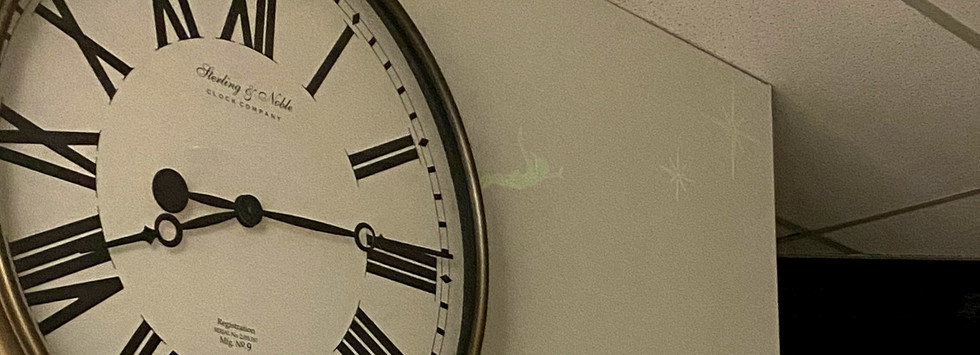
For my large clock face, I found a perfectly giant piece and took it apart to spray paint the border the same bronze color as my crocodile (see below). That color tied in well to my lamps, clock, wood color, etc. So I stuck with it. I hate hearing clocks tick, so I set it to stay at 8:15. That's the time Big Ben is on when Peter, Wendy, John, and Michael pay it a visit.

Then I also decided that a full statuette would be a fun addition. So, like everything else, it got a coat of bronze spray to make it match all of the other accents before being placed next to Tink's little stash of pixie dust.
Tinkerbell:
This one might be a stretch: but when I saw this antique lamp, I knew I had to have it. The shape of the lamp just made me think of everyone's favorite pixie's hairstyle. I have no idea why. But that, coupled with the 'blonde' coloring, made me decide that it was the perfect accessory to dress up my credenza. It also added a height element that makes this wall the most beautiful one in my office and a perfect background for my desk.

Pixie Dust:
What would Peter Pan be without a little pixie dust? While I love sparkles and would willingly cover my office in them, that's generally frowned upon. So instead, I confined by shimmer to a little bottle that sits right next to Big Ben- I laid a very thin layer of sparkles on top of my two lamps and table.

Weirdly enough, the hardest part of this was deciding on the right bottle for the pixie dust to be in. I spent (again) way too much time buying every version of miniature bottle, setting them side-by-side, and if you follow my Instagram, you probably voted in the poll I had to have because I couldn't decide. Throughout the movie, Tink's pixie dust is presented in a few colors. Sometimes it looks white, sometimes it looks gold, sometimes yellow. I mixed a few colors of glitter to get this champagne tint that I figured tied in nicely to the bronze accents as well.
The Crocodile:
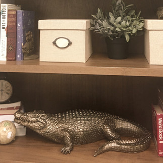
Go on the internet and search for a bronze crocodile and you're going to find the exact statue I made for at least $70 plus shipping. Funny enough, the statue that these Etsy sellers use (then paint) is available on Amazon for just over $50. Get yourself some bronze spray paint (the same paint I used for the border of my large clock), and you've got your very own for at least $50 cheaper! I found an adorable bronze alarm clock that looks like the one from the movie with just one bell (again- I did way too much research) and placed it right next to my croc to make the resemblance super obvious to the professional Disney lover.
The Mermaids:
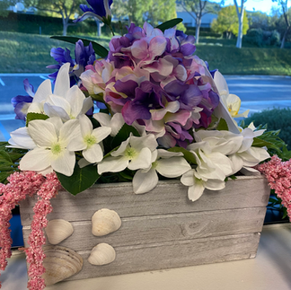
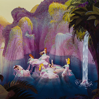
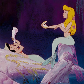
I needed some (fake) life and color in my office- so I decided to make two window boxes inspired by the mermaids. I studied the different foliage around this scene, colors, and came up with something I think does a pretty good job.
Captain Hook:
Everyone's favorite Captain, Mr. James Hook, would be nothing without his ship (everybody knows that). I did actually find an exact replica of his ship for roughly $500, but I'm not that committed.

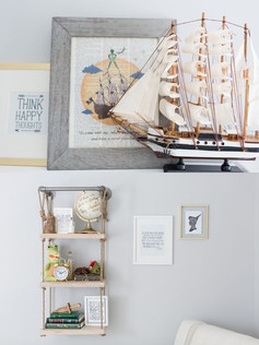
So instead I found this one at an amazing price and gave it a prestigious spot up on top of my bookshelf poised conveniently next to Big Ben and the pixie dust that makes it fly.
The Flight to Neverland:
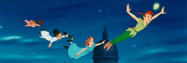
Originally I just bought some decals of Peter, Wendy, Michael, John, and Tink flying to put near my giant clock face. However, they blended in with the wall too well. We stuck one somewhere else on a wall in here and I can't find it. So I decided to make these little guys just a tad more obvious (and a whole lot more fun), I would add a layer of glow-in-the-dark puffy paint. Nobody besides my tired self and the cleaning crew ever sees them come to life- but every night, when the lights go off, the Darling children follow Peter Pan to the Second Star to the Right- and straight on 'till morning.
Before and After
Last but not least, here's the before and after. I could not have picked a better theme for the office or layout for my little sitting area. It honestly looks like what this office was made for- and the untrained professional would never realize the tied-in theme unless they had a good eye and a real love for Disney movies:

So go ahead and tell me- how'd I do?!


























Comments